Showing posts with label Prismacolor Projects. Show all posts

Monday, February 22, 2010

Hate Your Job?

Pin It


Another Monday ... already?!? Is it just me or are these things comin' around faster?

Today's card project was created for a dear friend who's currently going through a rough time:

The sentiment is from Stampin' Up's "Thoughts and Prayers" set, stamped in 'Rich Razzleberry' dye ink on 'Whisper White' card stock.

The dragonfly image has been in my collection for-evuh ... and I believe this is the first time I've used it! I stamped the winged-thing in 'Basic Black' dye ink and colored it with Prismacolor pencils blended with Gamsol (OMS.) I cut them out and mounted them on my embossed card stock using dimensionals.

For the 4-1-1 on the rest of the products I used, check out the supply list, below.

Sooooooooo, this Sunday Sheila and I were hangin' out when her insane sister, Jill, dropped by:

"I dread going to work: I hate my boss. I hate my commute. I can't stand the office manager. I despise the girls in the office. The guys in my office are all pigs. The benefits stink ... and the pay sucks." Jill whined.

"Ohhhhh, you poor thing ... you hate your job? Well, why didn't you say so? Listen: there's a support group for that. It's called EVERYBODY, and they meet at the bar." Sheila snapped.

Thanks for stopping by today; I hope your Monday is as good as ... a Monday can be!

~Hugs,


Today's Challenges:

Card Recipe:

  • Card Stock: "Kiwi Kiss," "Rich Razzleberry," and "Whisper White" Card Stock by Stampin' Up
  • Stamps: Dragonfly by All Night Media; Sentiment from "Thoughts and Prayers" Stamp Set by Stampin' Up
  • Ink: "Rich Razzleberry" Dye Ink by Stampin' Up
  • Color Medium: Prismacolor Premier Pencils (PC912, Apple Green; PC928, Blush Pink; PC931, Dark Purple; PC924, Crimson Red; Sharpie Paint Pen
  • Accessories: "Stylized Flowers" A2 Embossing Folder
  • Tools: Die-Cut Machine; Square Dies; Odorless Mineral Spirits by Gamblin; Blending Stump; Stampin' Dimensionals and SNAIL Adhesive by Stampin' Up
  • Finished Size: 5 1/2" x 4 1/4"
Shop for Stampin' Up products online ... 24/7 ... HERE

If you have any questions about Stampin' Up products or stamping techniques, feel free to contact me HERE.

Friday, August 29, 2008

Have a Nice Trip? See Ya Next Fall ...

Pin It


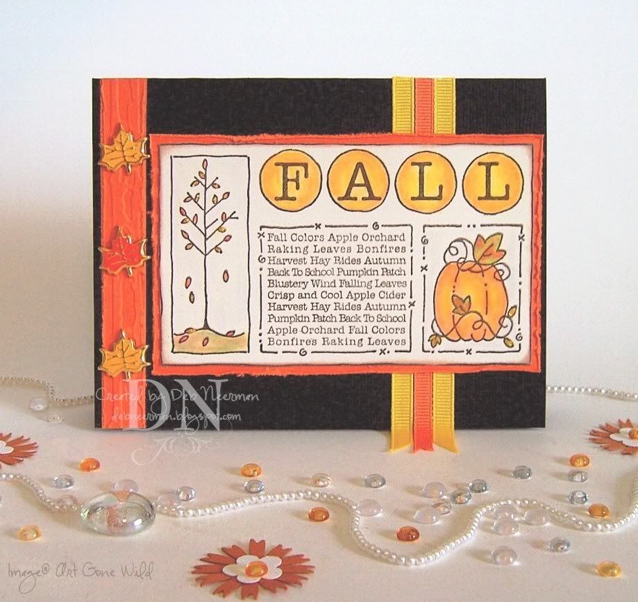
This card is my very first Fall card making project and was created for absolutely no reason other than the fact that I wanted to ink up this humongous rocker stamp from Art Gone Wild.

I stamped my image on Stamper's Select card stock, then colored it with Prismacolor pencils, blending with Gamsol. I added a teensy-tiny bit of yellow Stickles glue onto some of the leaves, then mounted the image on card stock that had been run through the Cuttlebug in the "Distressed Stripes" A2 embossing folder.

I used a Heidi Swapp distressing tool to rough up the edges of the embossed card stock, then mounted three metal leaf brads on a strip of the same card stock and adhered it to the left-hand side of the card.

Finally, I added some grosgrain ribbon to the right-hand side of the card, allowing it to hang off the edge ... 'cuz I'm wild and crazy ... and then adhered my matted focal image.

So, please allow me to be the first person to wish you a happy "More Herbs, Less Salt Day." It's funny, but I recall having a similar conversation with my Dad when I was in high school ... and then I was grounded for four years.


~cHEeRS,

  • Card Stock: Bazzill Basic; Papertrey Ink
  • Stamp: "Fall Frame" Rocker by Art Gone Wild (I cut off the frame part)
  • Ink: Staz-On "Timber Brown" by Tsukineko
  • Color Medium: Prismacolor "Premier" Pencils by Sanford
  • Accessories: Leaf Brads, HOTP; Grosgrain Ribbon; Stickles Glue by Ranger
  • Tools: Cuttlebug Die-Cut Machine; "Distressed Stripes" Embossing Folder by Provo Craft; Heidi Swapp Distressing Tool

PS: I seem to be in some kind of weird stamp-purgin' mode 'cuz I can't stop listing 'em for sale in my eBay store. I've also listed a kewl Stampers Anonymous catalog and a rare Zettiology catalog. And magazine back issues, including Stamp It!, and Somerset Studio. Check 'em out and see if you can find a treasure ... the price is right, that's for sure! And if you don't find something you LURVE today, there's always tomorrow! And I haven't even started on the unmounteds!

Wednesday, April 16, 2008

An Awfully Bright and W-A-Y to Cheerful Sketch and "Glitter" Challenge Entry

Pin It


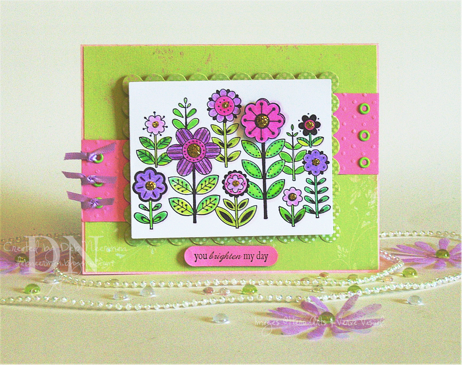
This wild-riot-of-color A2 card was created for Poetic Artistry's Mojo Monday sketch challenge. But ever since I won her Monthly Mojo Madness contest, I feel like, "omigosh, how am I ever gonna top that?" It's had an almost paralyzing effect on me: should I enter this card, shouldn't I, should I, is it good enough, no, it's not good enough, yes, it's good enough ... no, it isn't good enough, should I, shouldn't I, and on and on. But I put on my big-girl panties and am forging ahead; good, bad, or indifferent!

I just realized that this card also (barely) qualifies for Sharon's "Glitter" blog challenge! There's not a lot of it, but that's definitely glitter on the centers of those flowers. See, the thing is, I'm not much of a glitter-girl ... I love it when I see you do it, but me ... not so much.

This card would have qualified for a "15 Minute Project" ... except for the fact that I colored the stamped image with Prismacolor pencils, blending with Gamsol. The card itself; less than 15 Minutes.

I am head-over-heels in l-o-v-e with this new stamp from Hero Arts! I visit Michelle Rodgers' Stamper's Dream blog regularly and when I saw a card project she had done recently using this stamp, a compelling and irrestible force made me go immediately to her online store, Stamper's Dream, and buy it. Michelle shipped this baby to me at warp speed and I love it w-a-y more than any other stamp in my entire collection. Today. Tomorrow, next week ... maybe not so much. We stampers are a fickle lot, aren't we?

The sentiment stamp is from Verve Visual and is perfect to use with the SU word window punch ... so I did. I stamped my flower image twice and cut out one of the larger flowers, colored it, then popped it up on dimensionals over the first stamped image. The aforementioned glitter was sparingly applied to the flowers, I ran some pink card stock through the 'Bug in the Swiss Dots embossing folder, set some eyelets, tied on some ribbon, and was done! {breathe}

Oh. I also used a Copic marker (Pale Heath, V000), to create shadows around the right-hand side of all the flowers, but it doesn't show up very well in my photo. IRL, it looks kewl ... no, really! C'mon over, you'll see!

Thanks so much for spending part of your very busy day with me; you rock!

~Hugs,


Card Stock: Xerox 110#, Prism; Designer Paper: Memory Box; Stamps: Hero Arts, Verve Visual; Ink: Brilliance; Copic Marker: Prismacolor Premier Pigment Pencils; Gamsol: Gamblin; Ranger Stickles Glitter Glue; Cuttlebug Die Cut Machine; Swiss Dots Embossing Folder; Nestabilities, Large Square Classic Rectangle; Crop-a-Dile; Stampin' Up Word Window Punch; Eyelets, Unknown: Found in Mt. Eyelet; Ribbon, Darice; Dimensionals: Fiskars

PS: I'd also like to thank Julee of Poetic Artistry for honoring me with the "Arte y Pico" blog Award. Thanks so much, Julee!! Coming from you, this means a LOT to me!

Monday, April 7, 2008

Thinking "Winged" Things ... a Blog Challenge Entry

Pin It


Happy Monday! I hope your weekend was just perfect!

Today's card project was created for the Caardvarks "Flight of Fancy" blog challenge. This week's theme is "Winged Things." You can click on the photo for a closer look ... but you might want to put your sunglasses on first!

I inherited this Artful Stamper "Butterfly in Fern" stamp from one of my friends; she received it from her mother-in-law and I think she passed it on to me 'cuz it looked like it hadn't been cleaned in forever! A yucky, black, yucky mess. After a few hours of soaking, scrubbing, and soaking some more, I was finally able to remove at least 5 years worth of black ink. Since it was clean, I decided to dirty it up again for this challenge.

The image was stamped on Xerox 100# card stock, cut out, then colored in with Prismacolor pencils blended with Gamsol. Yup, for some strange reason, I cut it out first ... and no, I don't recommend doing it that way.

For my background, I ran some card stock through the Cuttlebug in the Distressed Stripe folder and used a Marvy Mega circle punch to create the "sun."

I added some bright green ribbon around the fold of the card and was done. Now off she goes to live in the Caardvarks gallery!

Thanks so much for spending part of your busy day with me!

~Hugs,

Card Stock: Bazzill, DCWV, Xerox 110#; Stamp: The Artful Stamper; Ink: Brilliance Graphite Black; Color Medium: Prismacolor Premier pencils; Gamsol; 1/4"Ribbon

Saturday, February 16, 2008

Thinkin' Spring ... and a Blog Sketch Challenge Entry

Pin It


Today's card was inspired by Sharon's Sketch Challenge and thoughts of spring!

This 4 1/4" x 5 1/2" side-folded card was created on Bazzill Basics card stock. I used a scrap bit of DCWV's "Posies" collection, a scrap from My Mind's Eye "Bohemia" collection, a bit of ribbon, some Dew Drops, and a beautiful rubber stamp.

This stamp always reminds me of May in New England; I so miss lilacs! Coloring this image, I can almost smell their heavenly scent. Obviously, this beautiful, unmounted stamp from "I Break for Stamps" is one of my favorites and has been in my collection for years. It's so much fun to color, too!

The image was stamped with Palette Hybrid ink, then cut and matted using dies from the Nestabilities Large Classic and Large Scallop rectangle collections.

I colored my image using Prismacolor pencils blended with Gamsol and a stump, and both mat layers been adhered using dimensionals ... y'all know by now that I gotta have shadows on my cards.

This card is slow to color but fast to put together ... a sketch to follow helps in that department, too. Why not try creating a similar one in two 15 Minute sittings!

Ingredients:

  • Textured Card Stock: Bazzill Basics
  • White Card Stock: Xerox #110
  • Designer Paper: "Posies" Collection (DCWV); "Bohemia" Collection (My Mind's Eye)
  • Stamp: "Carte Postale" (I Brake for Stamps)
  • Ink: Palette Hybrid 'Noir' (Stewart Superior)
  • Color Medium: Prismacolor "Premier" Pencils
  • Adhesives: Tape Runner (Tombow Mono); Dimensionals (Fiskars)
  • Ribbon: "Straight and Narrow" (Offray)
  • Accessories: Dew Drops "Grape & Leaves" Collection (The Robin's Nest)
  • Tools: Die Cut Machine (Provo Craft); Nestabilities Dies (Spellbinder's); Gamsol (Gamblin); Blending Stump (Dick Blick)

BTW, today's card was photographed in my brandy-new, home-made "Infinity Box." I soooooo wanted to buy one ... until I saw the price tag! Holy Pajama's, that was a huge wake-up call! Oh, so's ya know, these thangs are also called "Infinity Tents," "Infinity Backgrounds," "Infinity Back-Drops," and other kewl-soundin' infinity-box-bag-ground-thingies.

So, for $1.79 and some supplies that I already had (and I'll guarantee that you already have 'em, too), I made my own. If you've been craving one of these boxes, you're gonna love owning one that cost less than $2.00 to make!

And, cuz I'm always thinkin' of you guys, you can Paypal me your savings ... all $998.00 (+/-) worth. I jess know you'll feel so much better about this if you do.

Thanks so much for spending part of your weekend with me! And, if I haven't told you lately, I really appreciate your visits and your comments!

~Hugs, Deb

Tuesday, January 29, 2008

A Copic Marker / Prismacolor "Premier" Pencil Comparison

Pin It


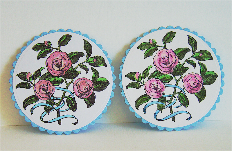
Click on this image: can you see the difference? Is that difference worth hundreds of dollars??

I'm being completely honest when I tell you that I'm a tool junkie. I love tools, all tools, any tools. I covet tools! And I don't discriminate, I want 'em all: markers, pencils, rulers, tapes, glues, punches, scissors, dies, eyelet setters, embossing tools, measuring tools, sanding tools, well, you get the picture!

When the Prismacolor Premier colored pencils first came on the rubber stamping/paper crafting scene, they were hailed as the greatest. thing. ever. to use for coloring. And while that's still true, and no secret to the hundreds of thousands of artists who'd been (and still are) using these amazing pencils, the rubber stamping/paper crafting world quickly embraced them, cherished them, and called them their own.

But now, suddenly, they've been pushed aside by the newest. greatest. thing. ever: Copic markers.

I own $80.00 worth of Prismacolor Premier pigment pencils ... or, 72 colored pencils. I also own $160.00 worth of Copic markers ... or, 48 markers. So, in a convoluted manner of speaking, I've paid twice as much for the Copic's and got half as many coloring tools ... and my marker collection is far from complete. I definitely need more of the lighter shades for blending. I figure I need at least another 6 or 8 markers (at 3.99 +/- each), to complete my somewhat limited palette.

I'd also like to point out that I'm purchasing Copic 'Ciao' markers; not the more expensive 'Sketch' markers.

Now, I'll be the first to admit that I'm a beginner with the Copic's ... there's a fairly steep learning curve with these tools and I've got a long way to go. But today, as a test, I decided to stamp and color two images: one with the Copic's and one with the Prismacolor's.

I used the same card stock to stamp my image; I also used the same ink. And I tried to match the colors I used as carefully and as closely as possible. When completed, I mounted the stamped images on identical turquoise card stock.

Now, look again at the above photo ... they match up pretty closely, wouldn't you say?

As far as ease of use goes, I have to pick the Prisma's. In fact, I basically scribble in my colors, blending with an inexpensive paper stump and odorless mineral spirits, also quite inexpensive. I go back over my colored images with lighter tones in the same color family, creating highlights, and darker tones creating shadows. The truth is, most art-style rubber stamps are created with shading marks indicating where the stamp artist wants his or her shadows. If I make a mistake, or go out of the lines, I can erase the wayward pencil marks and continue. It's pretty hard to go wrong here.

Using the Copic's, I find I have far less brush control; even the super brush end is fairly wide. By and large, I'm coloring rubber stamped images and more often than not these images are small ... in fact, downright tiny in some cases! Imagine how much better these markers would be if that brush was half of it's current size.

Which causes me to mention this: there's no erasing your mistakes using alcohol-based markers. You may be able to remove some of the color using your colorless blender but it's not going away. Which is why most artists recommend that when you create an image to color, create two ... or even three, so that you're prepared for the almost inevitable coloring mishap.

One other thing I dislike about the Copic's is the bleed-through they create. I realize that most people aren't going to pull up my colored image to see what the backside looks like but I know it's there and I don't like it much. I always use top-of-the-line 110# card stock or Bristol vellum for stamping and coloring; this isn't about coloring on an inferior paper. I can't help but wonder what this bleed-through does, or might do, to the overall integrity of the card stock.

Also, you must be absolutely certain you've really snapped those marker covers on tightly; left open, or even slightly uncovered, they'll completely evaporate in a matter of hours. And I've discovered that a marker that looks tightly closed, isn't necessarily ... push harder a second time on your closed cap, and I'll bet you'll feel it 'snap' together. So, on top of all my usual craziness, I'm now paranoid about firmly capping (and double-checking), my Copic's!

The last thing is a minor detail but worth mentioning when using alcohol-based markers and inks. They stain. Badly. And usually, permanently.

On the Copic plus side, these markers are refillable and the nibs are replaceable. I've no idea what a new nib, or a set of new nibs costs, but I do know that it's not cheap to refill the markers. Having said that though, refilling your marker is far less expensive than replacing it.

I also like the wide range of colors available for the Sketch markers ... although the range is not nearly as wide if you're purchasing the Ciao's, as I am.

You can also airbrush with the Sketch Copic's ... you can't airbrush with the Ciao's, but I hear through the alcohol marker grapevine *wink* that there will be an airbrush system available sometime in the future for use with the Ciao's.

Somewhere here in blogdom I recently watched a video tutorial by a smart gal who uses dimensionals to adapt the airbrush fittings to accept the Ciao's. If anyone has a link or remembers the name and/or blog of this savvy marker person, let me know and I'll add it to this post.

The one thing I do love about the Copic's is that you can color-match practically anything with them. Don't have a ribbon to match to your project? Grab your Copic and color one to match! You can color acetate, metal, acrylic, fabric, and lots more. As a rule, if you can color it with alcohol ink, you can color it with your Copic's.

But as much as I love the idea of perfectly matching ribbon, I just don't think the end justifies the very expensive means. I can only go by my own experience and comparisons, but I honestly don't see all that much of a difference in these two samples. Do you?

Oh, the Copic colored image is on the left; the Prismacolor pencil colored image is on the right.

From my personal blurfing around in blogdom, I've noticed that lots of artists are really on the fence about purchasing these markers. The cost, obviously, is a huge factor. And the learning curve is steep. And by and large, most of us are using Copic markers to color rubber stamped images; which, while oftentimes beautiful, meaningful, and important, aren't exactly timeless masterpieces.

So, honestly, is the difference in these colored images worth the price?!?

You know what? I don't think it is ...
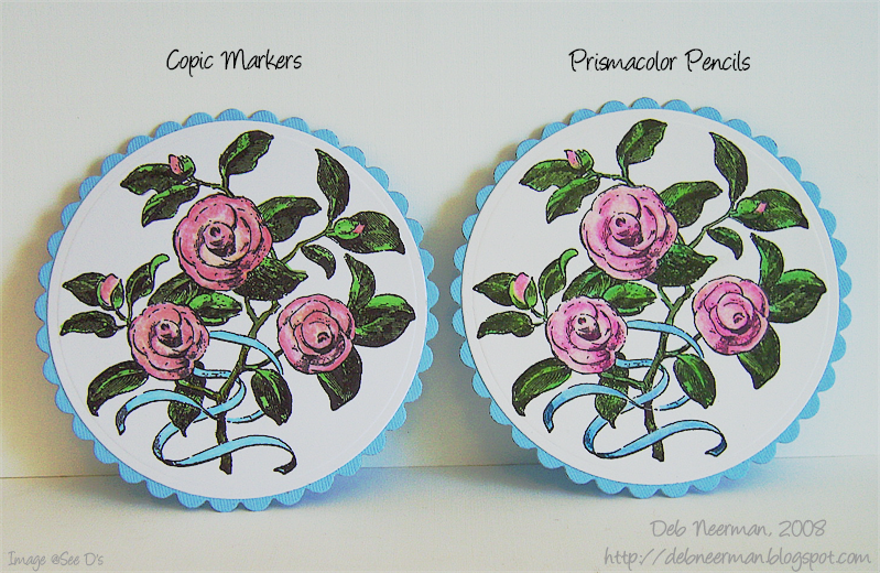
I'd love to have your opinion! Please feel free to post your thoughts and feelings on this subject so that we all might benefit from your knowledge. And it's a safe bet that you've got way more experience with Copic's than I.

Thanks so much for sharing part of your day with me!!

~Hugs, Deb

* EDITED TO ADD: I believe I've inadvertently caused a little confusion here. The Prismacolor pencils I'm referring to throughout are the Prismacolor 'Premier' pigment pencils ... NOT Prismacolor watercolor pencils (which are also terrific but not the subject of this post). Thanks!
Wednesday, January 23, 2008

Two 15 Minute Projects = One All-Occasion Card

Pin It


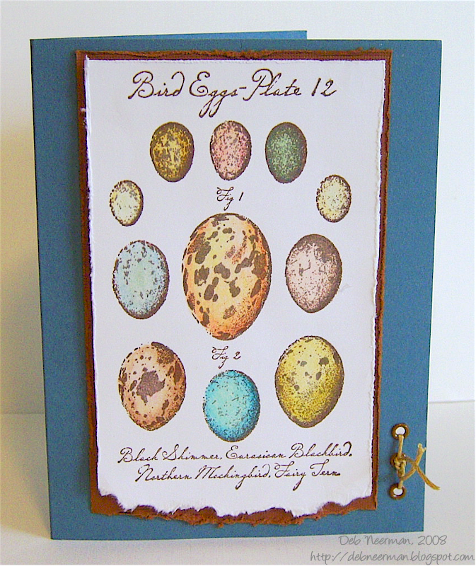
Today’s card was created in two sittings; in the first I stamped and colored my image, and in the second, I put it all together. You can click on the image for a closer look.

I used Stampin’ Up! Blue Bayou card stock for the base of this card. The torn-edge brown mat is Bazzill Basics; the 'Bird Eggs' image was stamped on my favorite white card stock, Xerox 110#… also torn.

I colored the stamped image using Prismacolor pencils and Gamsol (OMS), blending with a stump. I mounted the image on the brown mat using dimensionals.

Using a distressing tool, I distressed the top and side edges of both the white and the brown card stock. I love my pink Heidi Swapp paper distresser and use it often; if you don’t have one, you need one! And they’re really inexpensive; I bought mine on ebay for 1.19!

Using my Crop-a-Dile, I set three eyelets and tied some embroidery floss through the openings, knotting the ends on the front.

Overall, I’m pleased with this all-occasion card so I’ll package it up in a see-thru envie and stick it in my card stash. I’m thinkin’ that this image can be used for Spring, Easter, birthday, or thinking about you, cards. Maybe not so much for a 'Congrats, You’re Expecting' card though …

Ingredients:

~White Card Stock: Xerox 110#
~Textured Card Stock: Bazzill Basics
~Base Card Stock: Stampin’ Up!
~Stamp: Bird Plate (Tin Can Mail / Inkadinkado)
~Ink: Palette Hybrid (Burnt Umber)
~Adhesives: Tape runner (Tombow Mono); Dimensionals (All Night Media)
~Accessories: Eyelets (Unknown; found in Mt. Eyelet)
~Fiber: Embroidery Floss (DMC)
~Tools: Paper Distresser (Heidi Swapp); Crop-a-Dile (We R Memory Keepers)

I’ve received several questions from visitors and I think it’s time to address that. So, if you’ve emailed me or posted a question in the comments, check back tomorrow as I’ll be tackling a couple of them here.

On Friday, I’ll post some blog candy you’ll have a chance to win simply by leaving a comment.

Thanks so much for sharing your day with me!

~Hugs, Deb

{PS} If you're interested in trying out the Xerox 110# card stock I'm so in love with, visit my ebay store. I have an auction for 25 sheets ... the high bid right now is .99! Check it out here: Kewl Stuph and Funky Junque

Saturday, January 12, 2008

15 Minute Project ... for a "Tall and Thin" Challenge

Pin It

This side-folded, 4 1/4" x 7 1/2" card was created for Sharon's "Tall and Thin" blog challenge. And yes, it's a 15 Minute Project, too! For a closer look, click on the image.

I created the card using white Image Plus card stock and adhered card stock weight designer papers by 'My Mind's Eye.' I wrapped a length of 1/4" brown grosgrain ribbon around the seam and adhered the ends behind the designer card stock.

I stamped my image on a scrap of Image Plus card stock with Palette Hybrid ink in 'Burnt Umber.' Next, I colored my image with Prismacolor 'Premier' pencils, blending with Gamsol and a stump.

Then, I mounted my stamped image using dimensionals on a coordinating piece of designer card stock cut and embossed with the Nestabilities Large Classic rectangle die. I also cut a second rectangle, this time with a scalloped edged using a third color from this collection using a die from the Nestabilities Large Scallop rectangle set.

The entire mat was then mounted to the card base using more dimensionals so the card has a bit of depth; I love seeing shadows on cards!

Finally, I added five Dew Drops just below my stamped image using mini glue dots. And then my timer went off and I was done!

Ingredients:

White Card stock: Image Plus
Designer Paper: The 'Bohemia' collection (My Mind's Eye)
Stamp: Hero Arts
Ink: Palette Hybrid in Burnt Umber (Stewart Superior)
Color Medium: Prismacolor Premier pencils (Sanford)
Ribbon: Brown grosgrain (Offray)
Adhesives: Tape Runner (Tombow Mono); Mini-Pop Dots (All Night Media); Mini Glue Dots: (Glue Dots)
Accessories: Dew Drops 'Men's' collection (The Robin's Nest)
Tools: Cuttlebug Die Cutting Machine (Provo Craft); Nestabilities Dies (Spellbinder); Gamsol OMS (Gamblin); Blending stump (Dick Blick)

Tomorrow I'll be showing you the cutest Valentine's Day gift project ... yes, of course it's a 15 Minute Project!

Thanks for visiting today and have a relaxing and creative weekend!

Saturday, January 5, 2008

Clean and Simple but Definitely NOT a Fifteen Minute Project

Pin It

I hope you're enjoying a relaxing and creative weekend!

This morning I awoke knowing I was gonna have a full-on cold by noon. With that knowledge came an uncontrollable urge to color!

This must be some kind of weird throw-back to my childhood. When I was kept home from school, I remember spending most of the day coloring with crayons. Either that, or I'm having some kind of strange regression.

It was tough to choose (*wink*), but I decided against the Crayola's and went with colored pencils.

I stamped my image in black with Palette Hybrid ink on Image Plus card stock. The card base is Bazzill Basics textured card stock and the stamped image is matted on Bazzill Basics Trio of Trios, Aspen, from the Pier Collection.

Which causes me to ask this question: Does anyone know what an Aspen, a tree, (or a town in Colorado), have to do with piers? Unless piers are constructed using aspen wood ... ? But aren't aspens skinny trees? Skinny wood wouldn't make for a big old pier, would it? See, this is what happens when I get a head cold ... I just go off in all directions; sorry!

Back to the card: I colored the stamped image with Prismacolor pencils, blending with Gamsol and a stump. In my humble opinion, these pencils are THE best for coloring ... but even great pencils need a good surface to work their magic on. I use Image Plus 110 lb. white card stock; I always get a nice result with this card stock but if you have a great paper to recommend, I'm all ears. Please leave your recommendation in the comments and I'll definitely give your favorite a try!

Finally, I punched out the tab with a round tab punch, added a black frame hanger, a black brad, and tied a matching ribbon on the hanger. Putting it all together took less than fifteen minutes but the coloring; well, that went a bit over that!

Ingredients:

~Card Stock: Bazzill Basics

~White Card Stock: Image Plus

~ Stamp: Stampa Rosa

~ Ink: Palette Hybrid, "Noir"

~ Ribbon: Offray

~ Color Medium: Prismacolor Premier Pencils (Sanford)

~ Accessories: Black frame hanger (unknown - found in a mountain of brads); black brad (ditto); Photo corners: (Pioneer)

~ Tools: Gamsol (Gamblin); Blending stump (Dick Blick); Round tab punch (Stampin' Up!)

Now it's time to try and kill my cold with alcohol ... ooops, I mean orange juice. Thanks so much for dropping by!

~Hugs